A team of researchers in Denmark is transforming 30 years of geolocated data points on Danish quality of life into a powerful, easy-to-use data analytics tool for policymakers.
Academic researchers at Aalborg University’s BUILD (Department of the Built Environment) are making a huge cache of official government data measuring a wide range of quality-of-life indicators more usable and accessible to policymakers.
The hope is that insights from this data—recorded annually for more than five million Danish residents over almost three decades—can help identify factors behind rising inequality and be used to inform social and economic policy, resource allocation, and other decisions affecting the well-being of communities across Denmark.
Rising inequality affects 70 percent of the world’s population, according to the United Nations. Even Denmark, which from a global perspective has relatively low inequality, has not been immune to growing gaps in opportunity between communities and regions.
The Aalborg research team not only wants to harness the power of data and analytics to inform policies for more inclusive growth in Denmark, but also to share their tools and methodologies with urban planners and policymakers in other countries.
From Data Cache
to Insights and Impact
Viewed in relation to each other, these six indicators—education and income levels, housing values, employment status, proximity to education, and migration flows—offer a standardized way to measure the overall quality of life for residents in each municipality, and to compare trends between different regions.

Beyond publishing their research and presenting their findings to academic audiences, the Aalborg team wants to ensure that the data can be made broadly accessible in a way that will empower policymakers and other stakeholders to draw their own conclusions from the insights and stories embedded in the data.
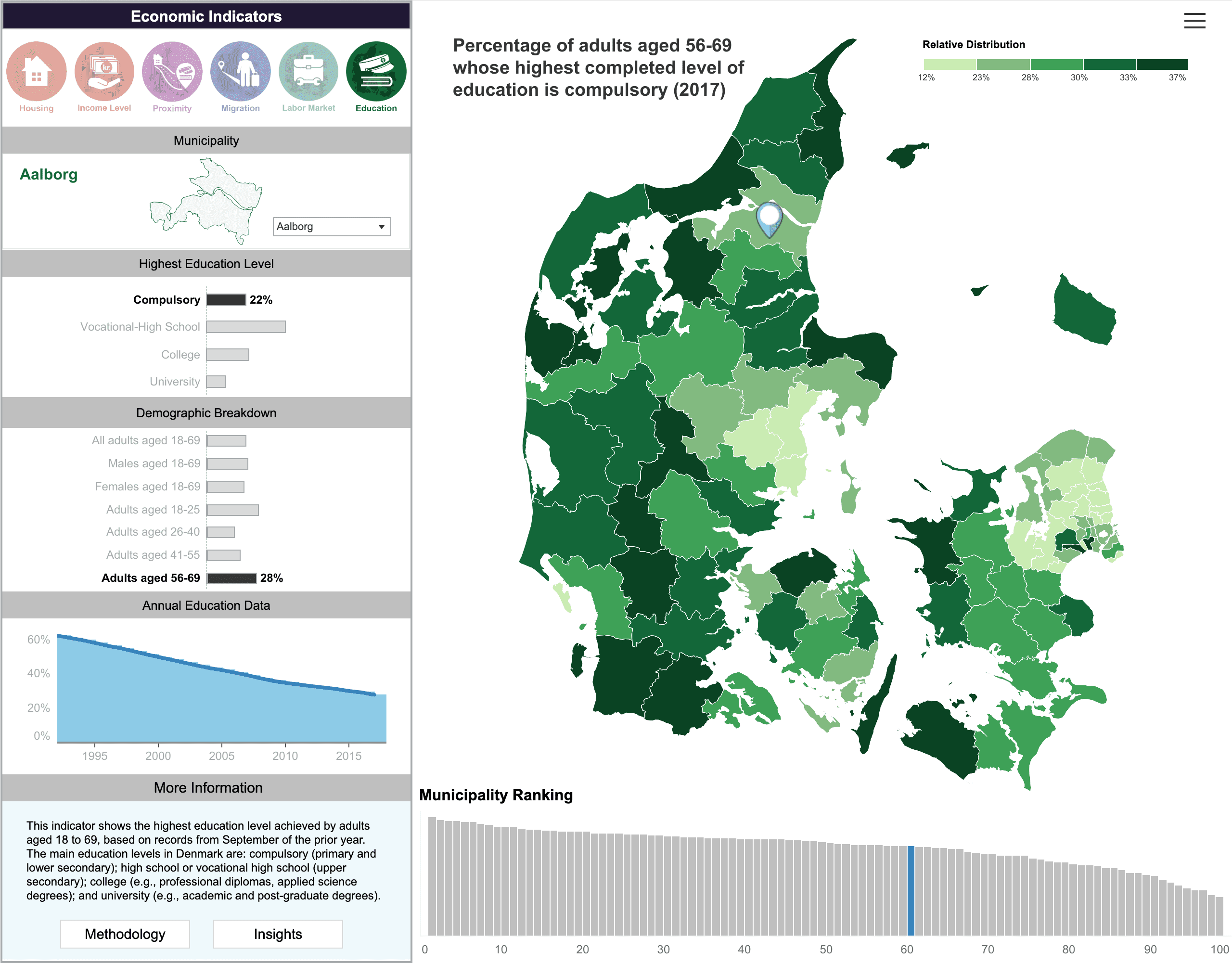
So this vast trove of information is being distilled into a web-based digital dashboard, using visually engaging interactive maps and graphs that will make it easy for policymakers, municipal planners, and others to use the tool.
Strategic Partnerships
To create a compelling digital dashboard, the Aalborg team needed resources and expertise beyond what they had at hand. While sophisticated use of data analytics and data visualization is increasingly used in commercial sectors to enhance products and services, public sector institutions and nonprofit organizations frequently do not have the funds or capacity to distill and visualize their data science work in the same way.
There’s where data.org, an initiative of The Rockefeller Foundation and the Mastercard Center for Inclusive Growth, is making a difference. Recognizing the enormous societal benefits that can be realized from broader use of data science in the public interest, data.org provides funding and technical support and forms strategic partnerships to build the field of data science for social impact.
In 2020, the Aalborg team was awarded a grant through the Inclusive Growth and Recovery Challenge, data.org’s grant competition aimed at funding innovative ways to harness the power of data and analytics for social impact. Since then, data.org has connected Aalborg with a number of strategic partners to complete specific aspects of the work.
Prototyping an Interactive
Data Analytics Tool
To help build a prototype of the interactive dashboard, data.org tapped The Rockefeller Foundation’s Innovation team, where I work as part of the data analytics department. We pulled together an interdisciplinary group of people with expertise in data visualization, graphic design, and user interface design, and together we worked with Aalborg to create a prototype in Tableau, a data analytics and visualization platform.
The goal was to create a visually appealing tool with an emphasis on color and a cleanly designed layout—a deliberate move away from dense, academic data analytics presentations that are more difficult for non-expert audiences to engage with. Through trial and error, we figured out effective ways to present the data clearly and accurately.
This included paring down information so the layout wasn’t too dense and crowded, and using color effectively to help people quickly identify interesting stories and trends. We created a visually distinct icon and color palette for each of the six indicators, and an iterative process helped us fine tune the way the data is colored and organized across the various maps and graphs.

More on Data Visualization
Are you interested in leveraging data for social impact? Check out the resource library at data.org, including this Getting Started with Data Visualization guide. For more information, please email info@data.org.